Product Design
Vantage
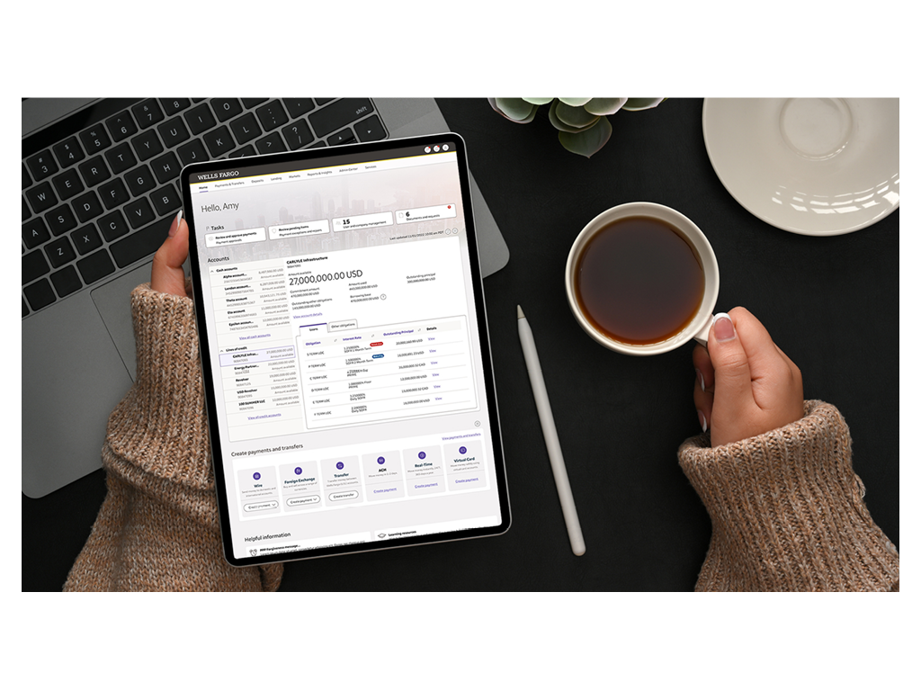
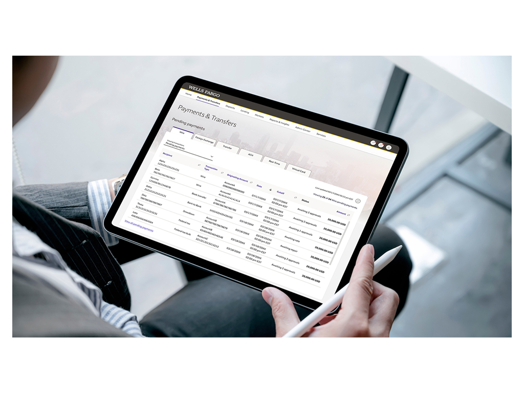
Vantage is a new platform that enables Wells Fargo’s commercial banking clients to run their businesses with a modernized, persona driven user experience, powered by the latest AI and ML capabilities.
Opportunity
The existing CEO (Commercial Electronic Office) product consisted of a landing page with a series of deep links to 60+ siloed product applications, rudimentary account balance information and no way of distinguishing between the various user roles found typically found within commercial banking organizations.
The new version of CEO, now called Vantage, will integrate the capabilities of the siloed applications into a persona based, cross-channel digital experience.
My Role
As the design director, I was responsible for the overall design of the product (information architecture, navigation, visual al design and branding) as well as core features like move money, credit & lending, Insights & reporting, alerts/notifications, task, user profile and settings. I worked closely with product management teams to ensure user needs were in a alignment with product requirements. I partnered with the design systems team to help build out a robust set of reusable components to be used throughout the new experience. I collaborated with the development teams to make sure what was built matched what the design, content product and accessibility teams had specified. I also contributed to the readiness materials used to communicate to our clients about the rollout of Vantage.
Results
Since it’s rollout in Q4 of 2022, over 1000 users has started using Vantage with no client complaints and or service calls.
To learn more, click to read the Wells Fargo press release.
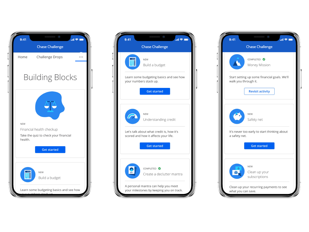
Chase Challenge
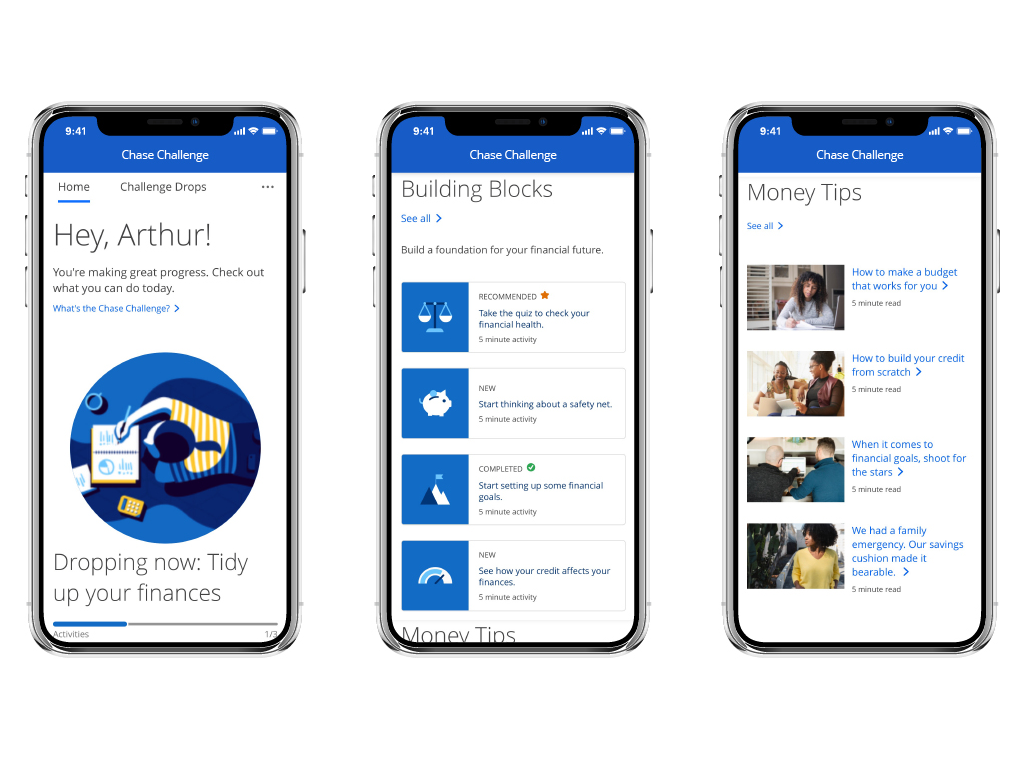
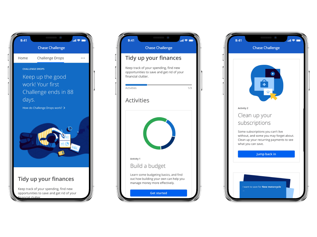
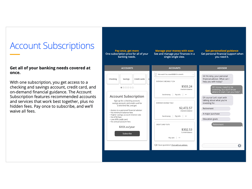
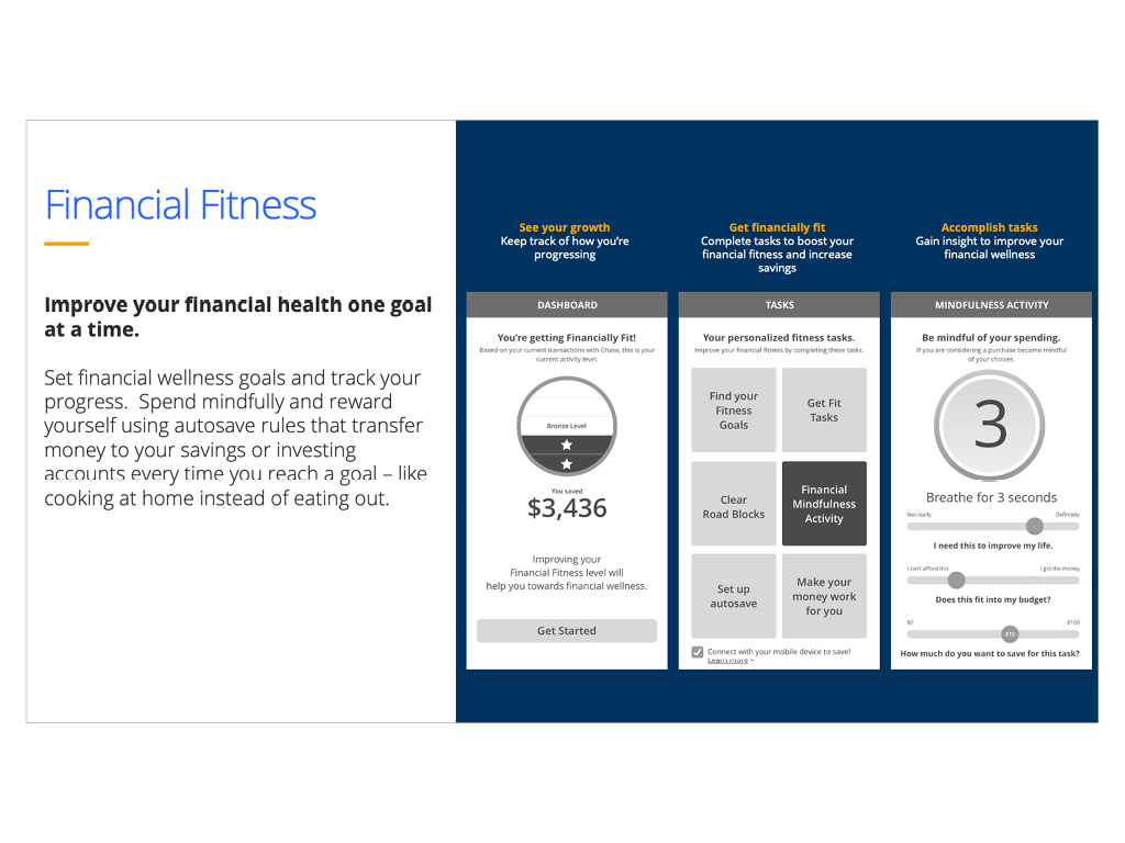
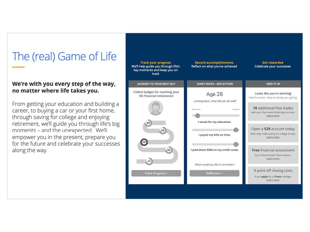
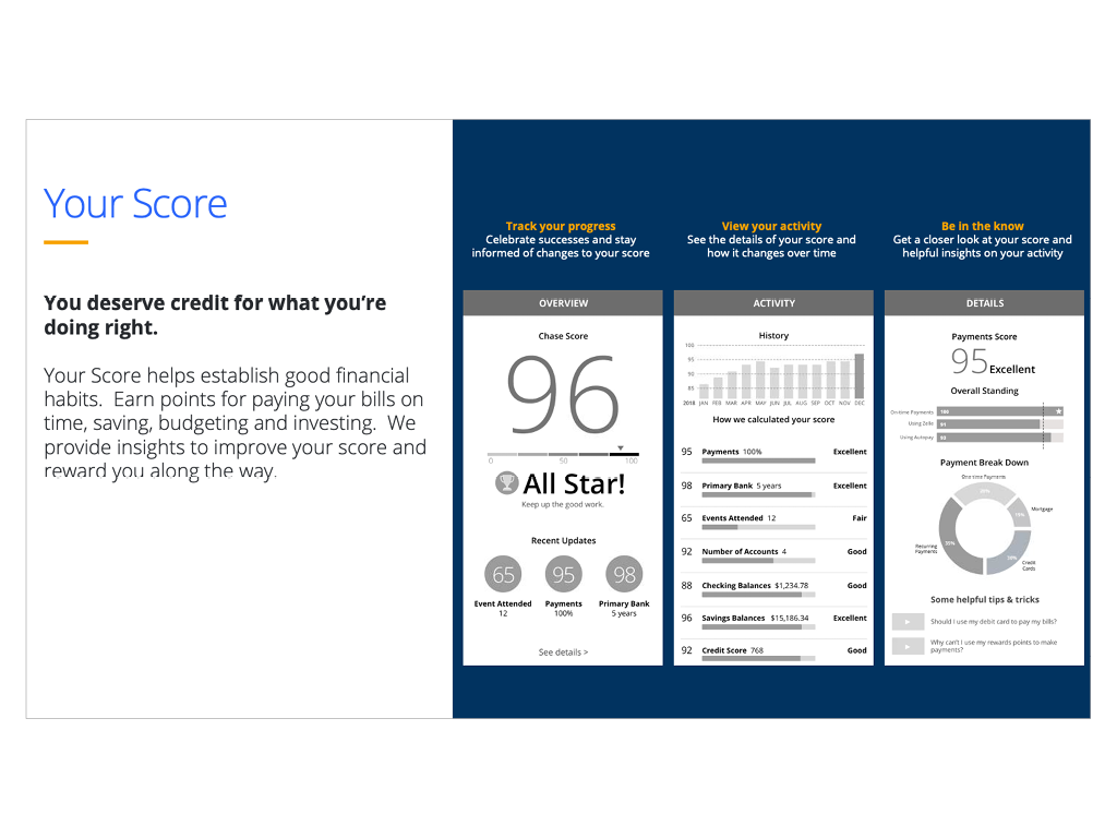
The Chase Challenge is a digital experience consisting of a series of activities and resources that helps user develop healthy financial habits.
Opportunity
People are stressed about their finances and acknowledge needing help to improve their finances, but despite the abundance of personal financial management (PFM) tools, people are overwhelmed and don’t know where to start.
By guiding consumers through small wins, we’ll give them confidence and validation they need to stay motivated throughout their journey to improve their financial health.
My Role
As the design director, I oversaw the creation of the user experience. At first, I managed the work done by an external agency and when we moved the work internally, I continued to provide direction to my UX designers and content editors. I partnered with the product management team to help define the product roadmap and used analytics to help identify future enhancements, worked closely with the development team to ensure the final product fully aligned with the design deliverables and collaborated with various user and market research teams to ensure the product’s usability and market fit.
Results
Since its launch in Q2 2021, +300k users have used the Chase Challenge with an average of 72% task completion rate resulting in 8k new account openings and product enrollments.
To learn more, click here
To view Cheddar.com/live news segment here
Prospect Dashboard
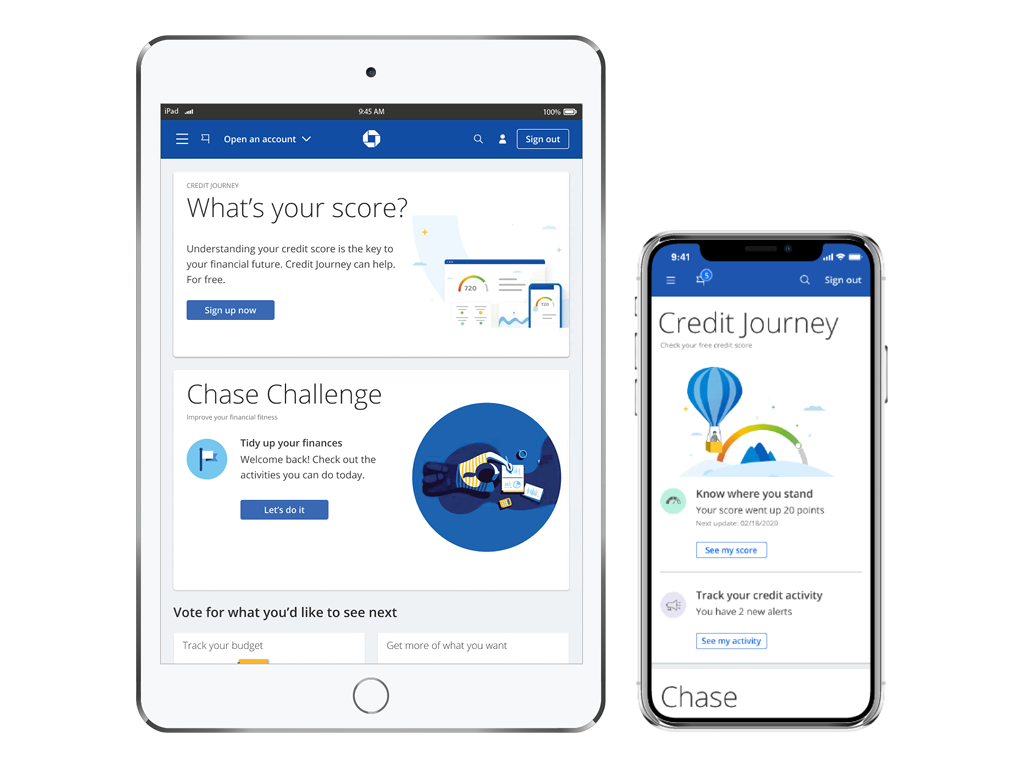
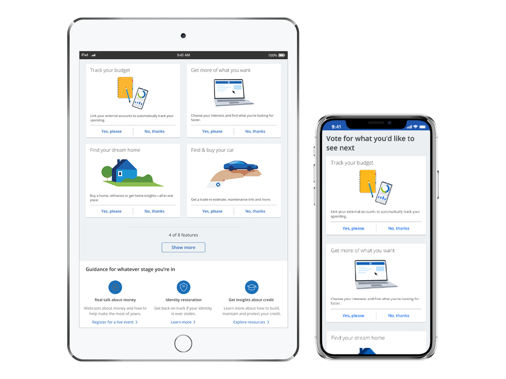
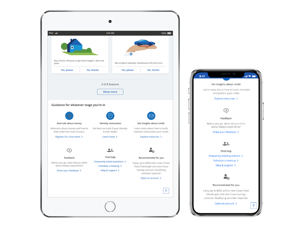
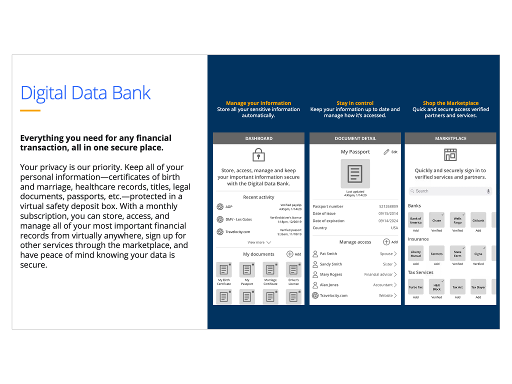
The Prospect Dashboard is an omni-channel experience that allows non-Chase customers to explore and use the same digital services available to existing customers without the need for a financial product.
Opportunity
With access to Chase’s rich set of features and tools, users can increase their financial knowledge and gain valuable insights as they navigate through life’s important milestones. This experience also enables Chase to increase it’s customer base, increase deposits and loans as well as deepen customer relationships by providing a fully personalized experience.
My Role
As the design director, I oversaw the design of the user experience created by my team of designers and content editors, I partnered with the product management team to help define which features should be included as well as worked with the various business leads to help define their prospect product roadmaps, I collaborated with various user and market research teams ensure the product’s usability and market fit, and worked closely with various web and mobile development team to ensure the final product fully aligned with the design deliverables.
Results
Since its launch in Q3 2021, +165k users have used the MVP version Prospect Dashboard resulting in ~25k new product enrollments per month. These encouraging results has the product team to secure addition funding to build out a more robust and personalized experience in 2022.
R&D Concepts
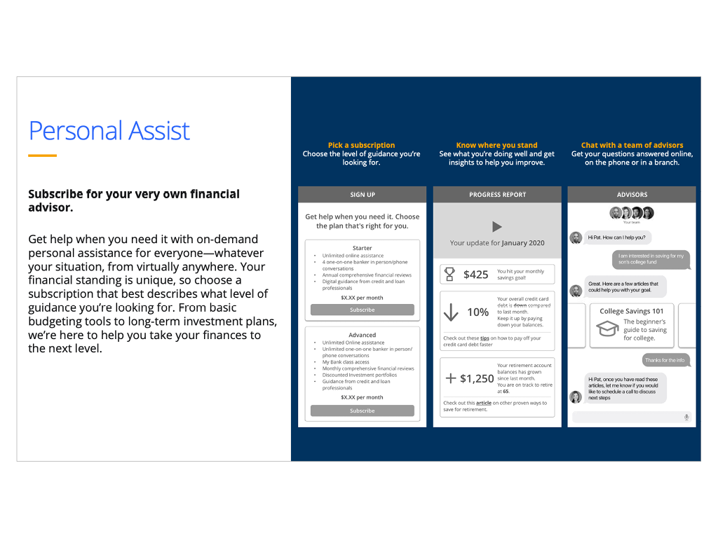
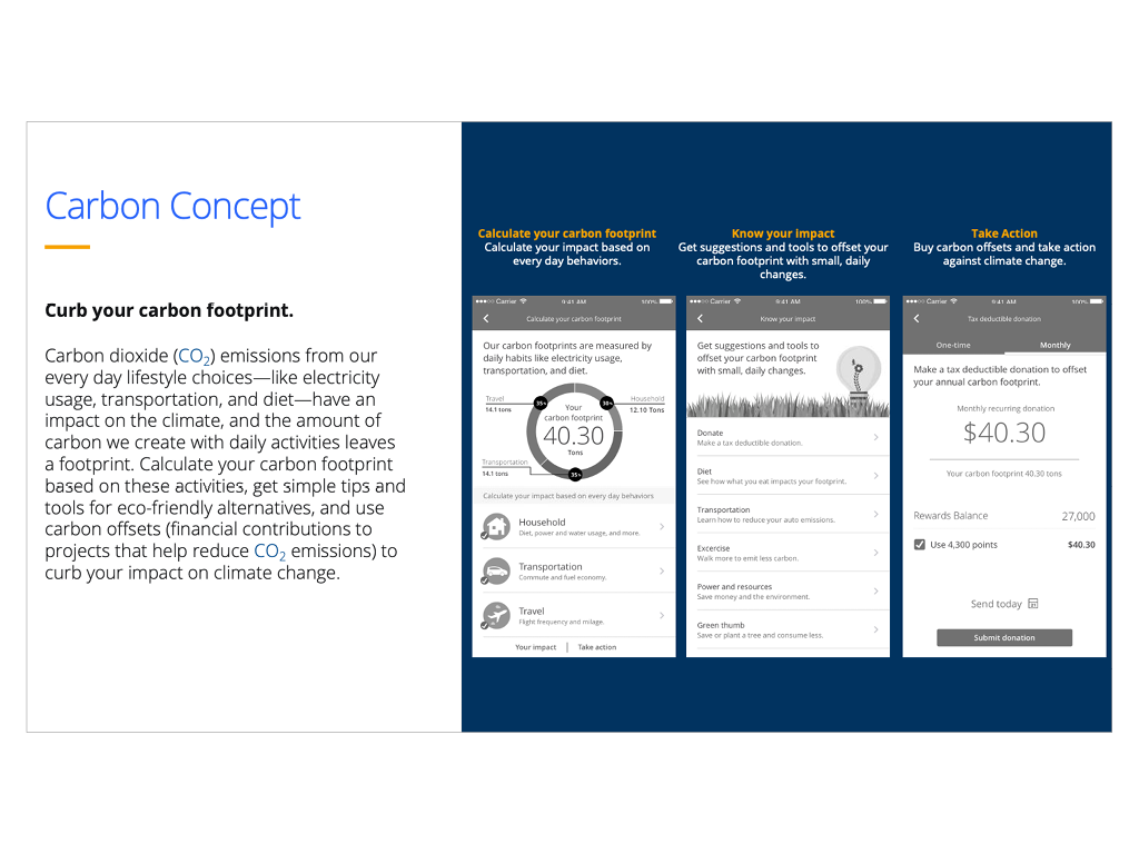
The Research & Development (R&D) concepts were part of an effort to quickly market test new product ideas with consumers.
Opportunity
In 2018, Chase established a multi-million dollar R&D fund to evaluate product ideas generated by Chase employees, product owners and or line of business leaders. A dedicated team of designers and product managers we assigned to create high-level UX concepts and conduct large scale market research studies to determine user interest and market fit.
My Role
I worked closely with the product managers to clarify the concepts and help define the concept briefs, I oversaw the design of the high-level UX concepts created by my team of designers and content editors, and worked with market researchers to define the research goals and participant selection criteria.
After a research study was completed, I would review the results and work with the product managers on next steps. If there was interest in a concept, I would work with the team that submitted the concept and refine the UX further and prep it for further research. For concepts that did not perform well, the team had the authority to “kill it”.
Results
Of the ~20 concepts we tested, 3 became actual product programs, 5 went into various product backlogs and the rest weren’t pursued, saving Chase millions of dollars in development costs.
The other key result of this initiative was it introduced a culture of “Test and Learn” into Chase’s product development process. We demonstrated that high-level concept testing could be done quickly and at scale before any code was written.
Digital Account Opening
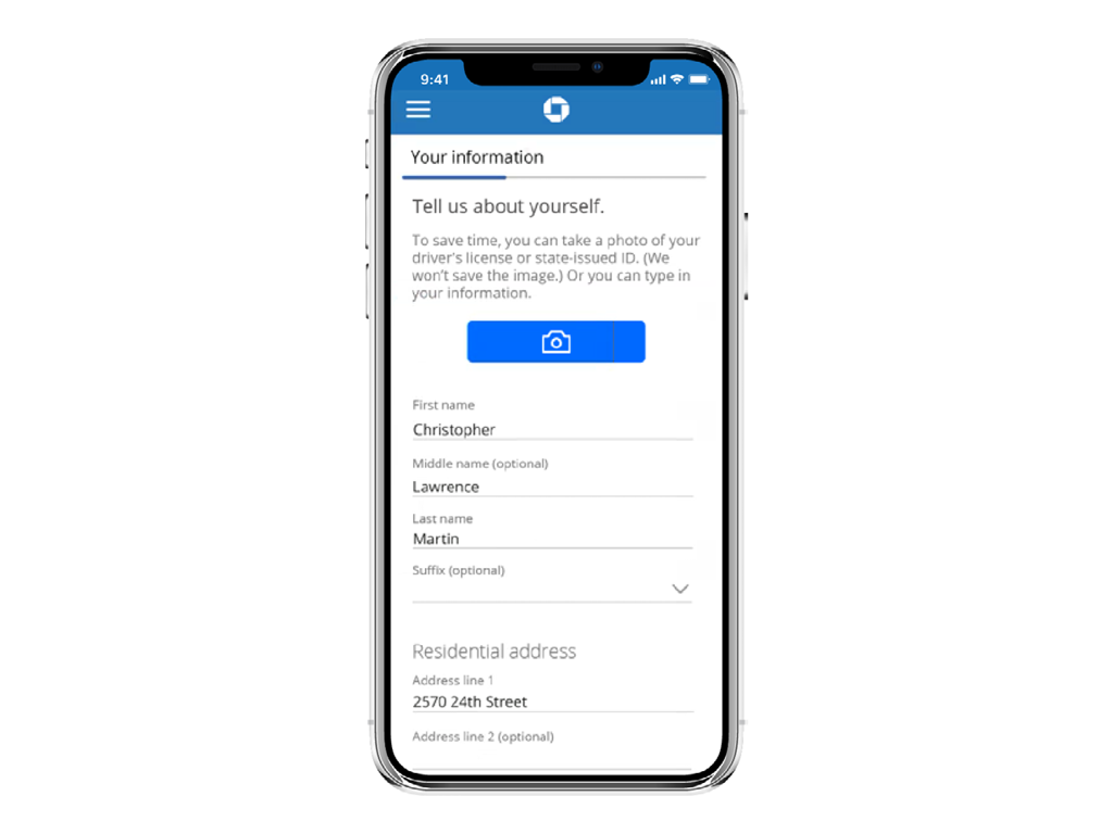
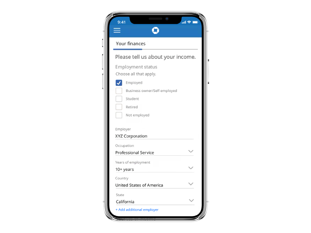
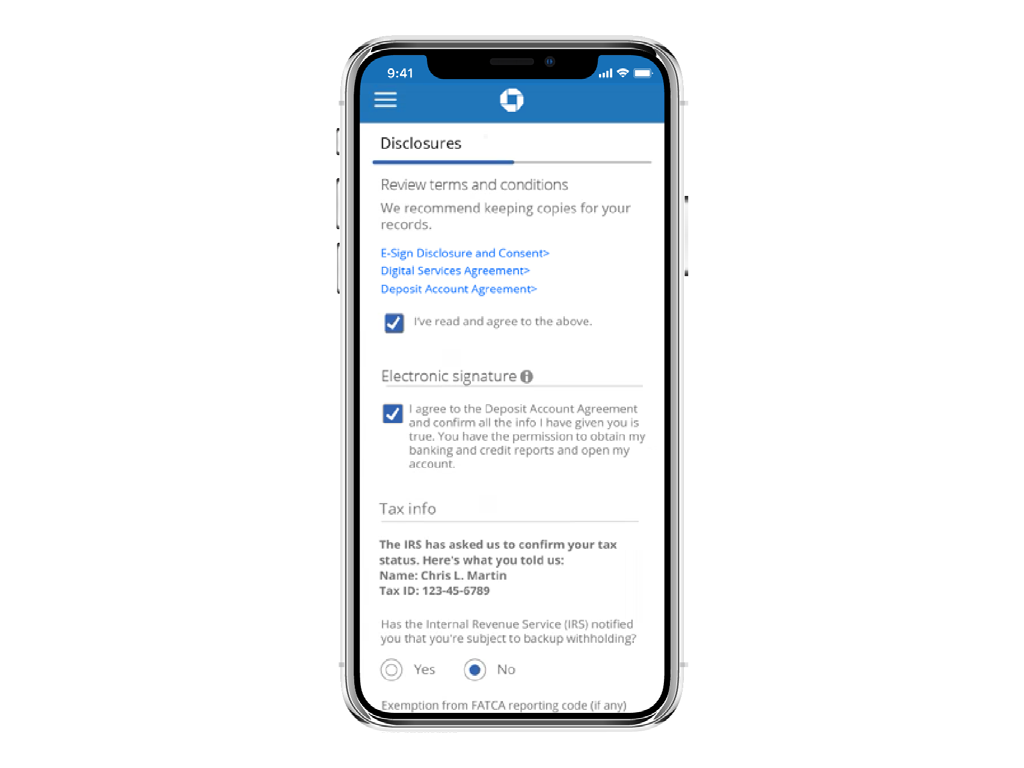
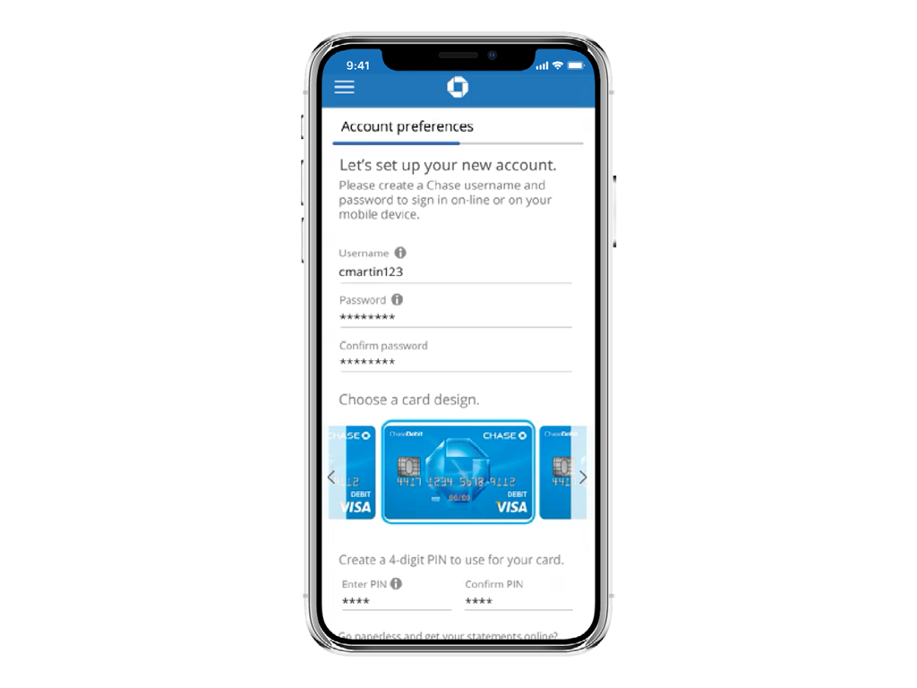
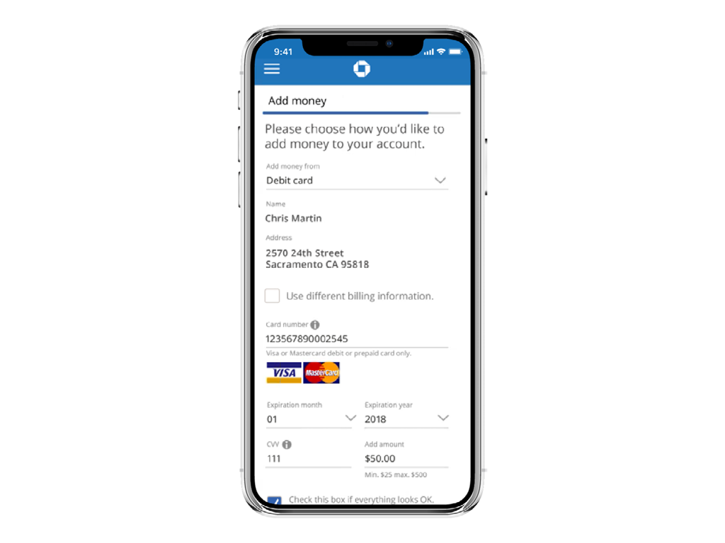
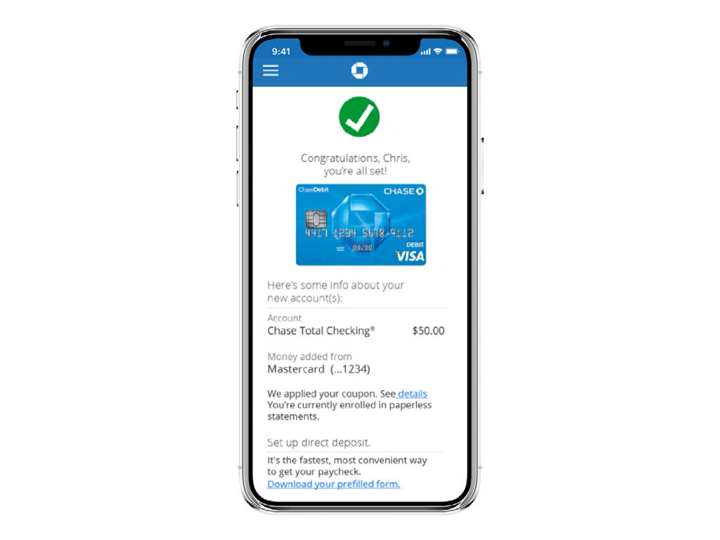
Digital Account Opening (DAO) is a cross-channel, responsive-web platform used by all of Chase’s business units for the opening of new accounts.
Opportunity
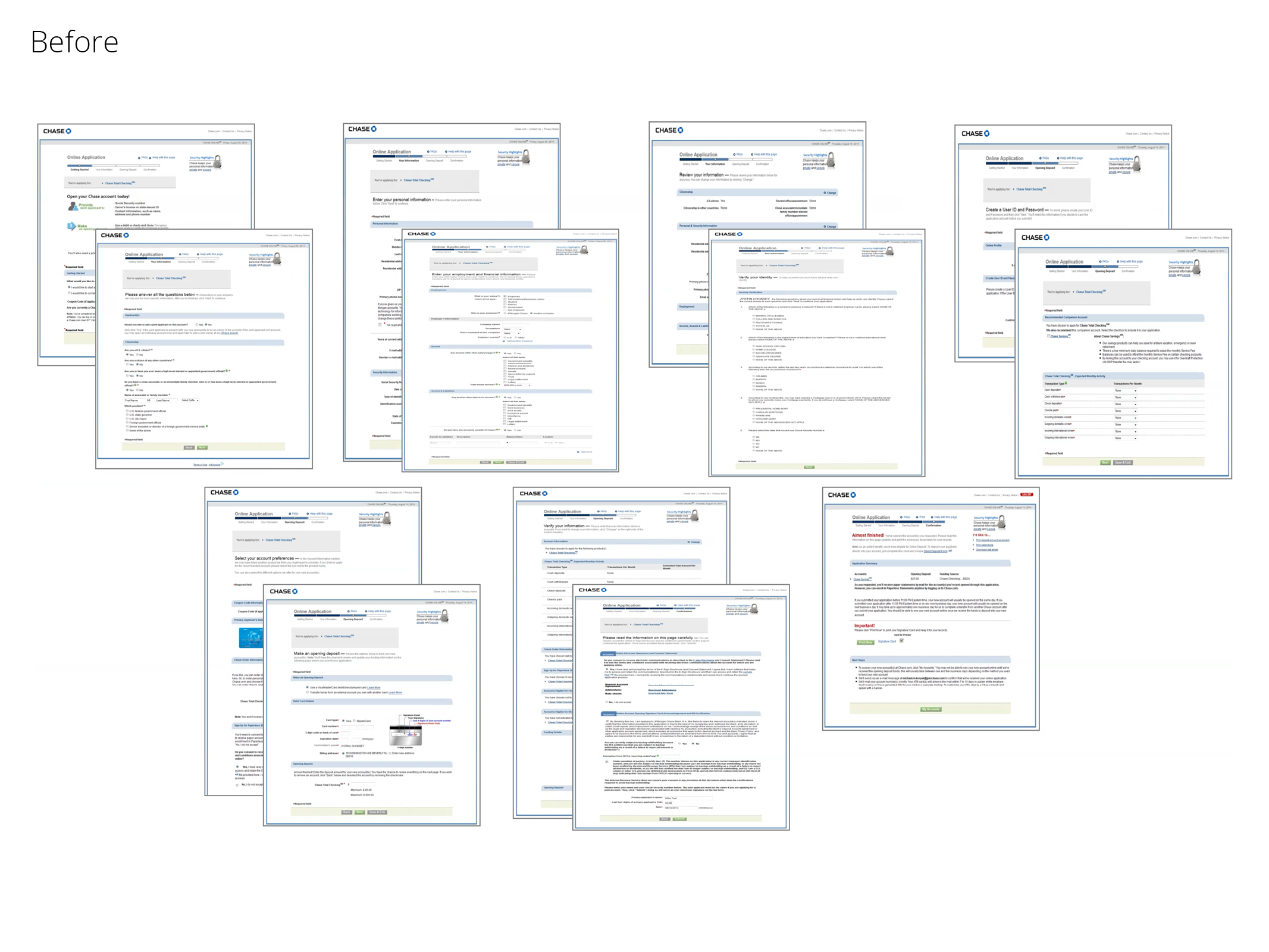
The DAO product initially focused on optimizing the account opening experiences for checking and savings. Previous versions of these experiences under performed due in part to the excessive number of required steps in the flow, an average completion time of 20 minutes and being only available on desktop.
My Role
As the product owner and design director, my team and I used market insights, user research and origination data analytics to optimize the end-to-end user experience. We did competitive/comparative analysis of other banking and consumer account opening experiences, conducted multiple concept and in-depth interviews (IDIs) with existing and non-Chase customers, and reviewed detailed analytics to determine where users were unclear on how to proceed or abandoning the application. I partnered with legal and compliance stakeholders to ensure the required changes met regulatory requirements, negotiated project budgets with finance teams and oversaw the various development team responsible for the delivery of the final product.
Results
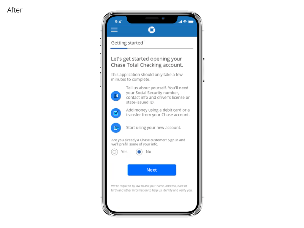
The re-designed version of DAO has 70% less steps and required fields, takes less than 5 minutes to complete, uses biometric authentication for identity verification and is fully optimized for all mobile, tablet and desktop devices. Since its rollout in late 2018, Chase opens ~ 250k new bank account across all business units per month, significantly out performing original estimates of ~350k accounts per year.
View live site here.
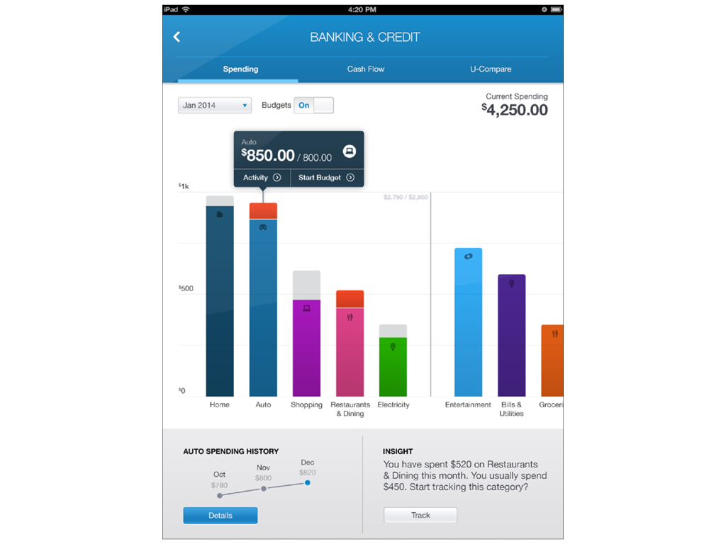
Tablet App
A next generation tablet app for Chase’s Consumer and Private Client customers
Opportunity
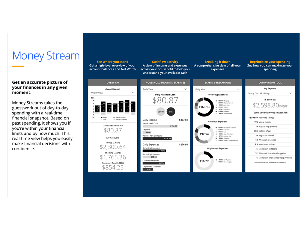
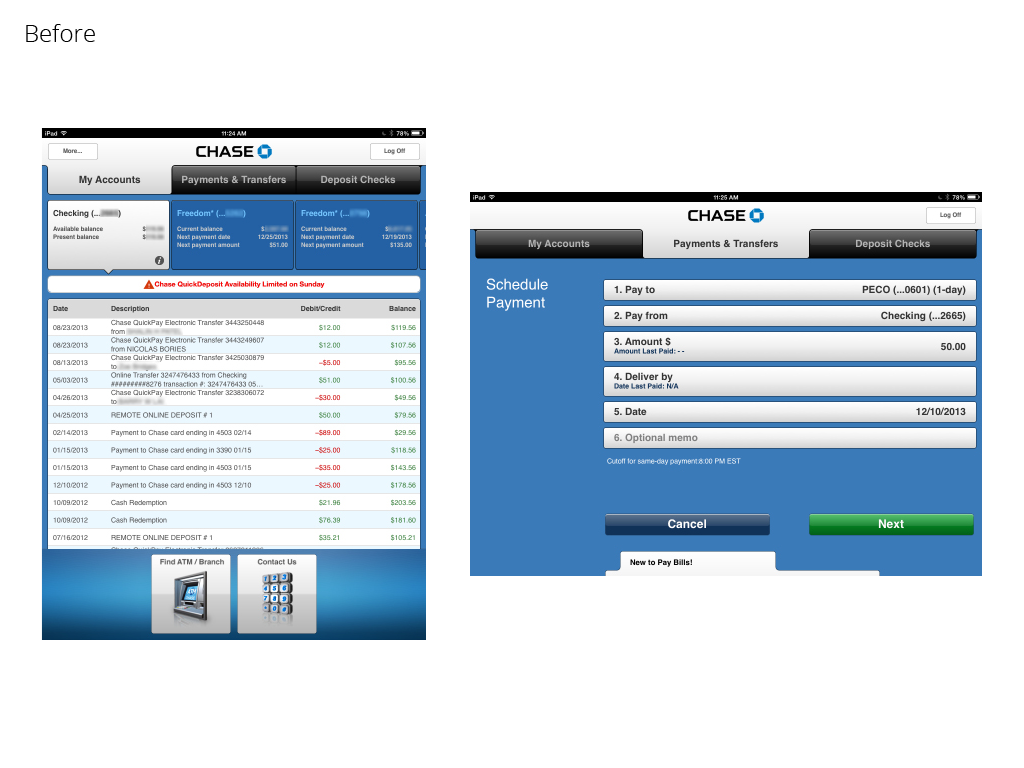
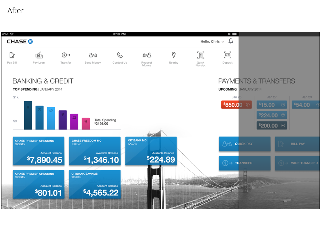
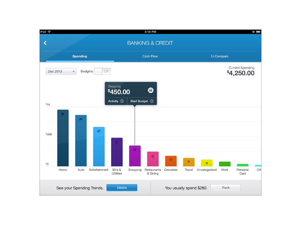
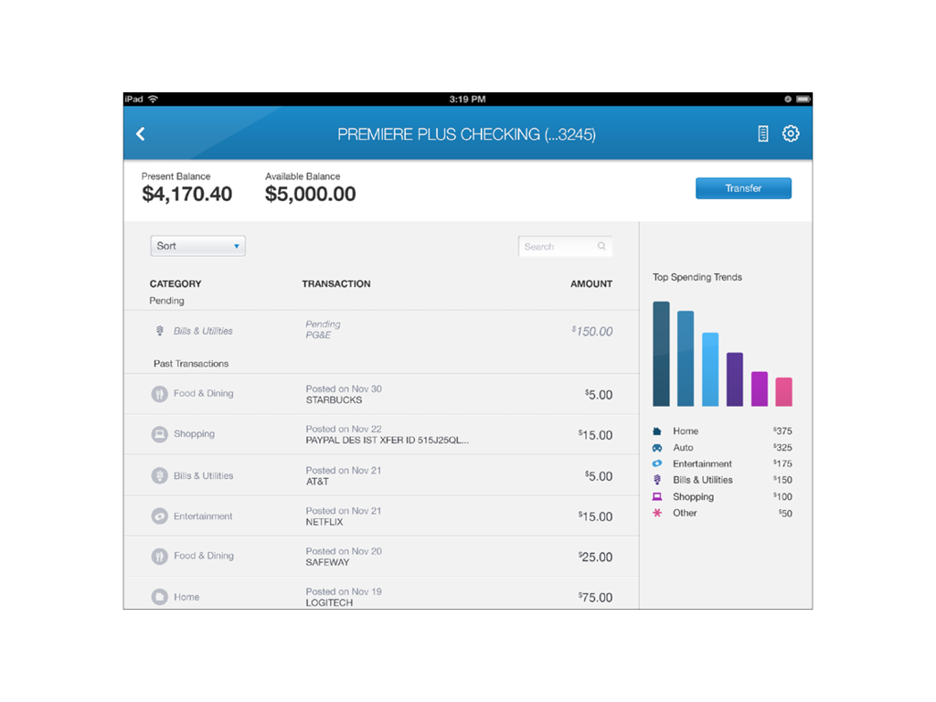
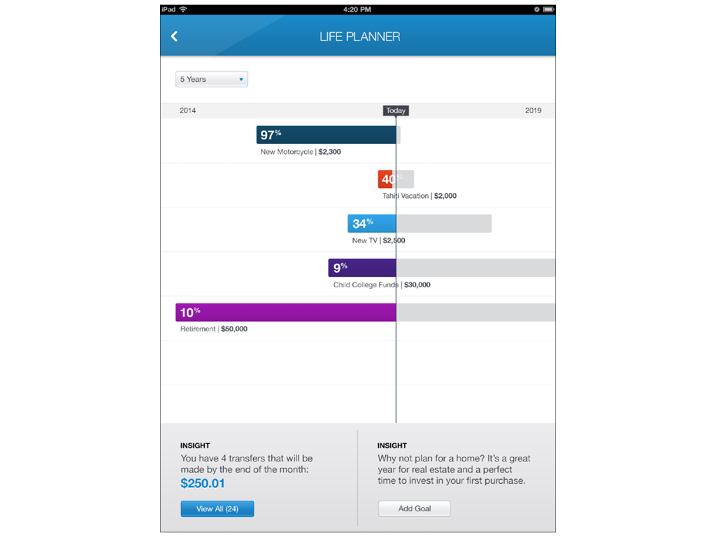
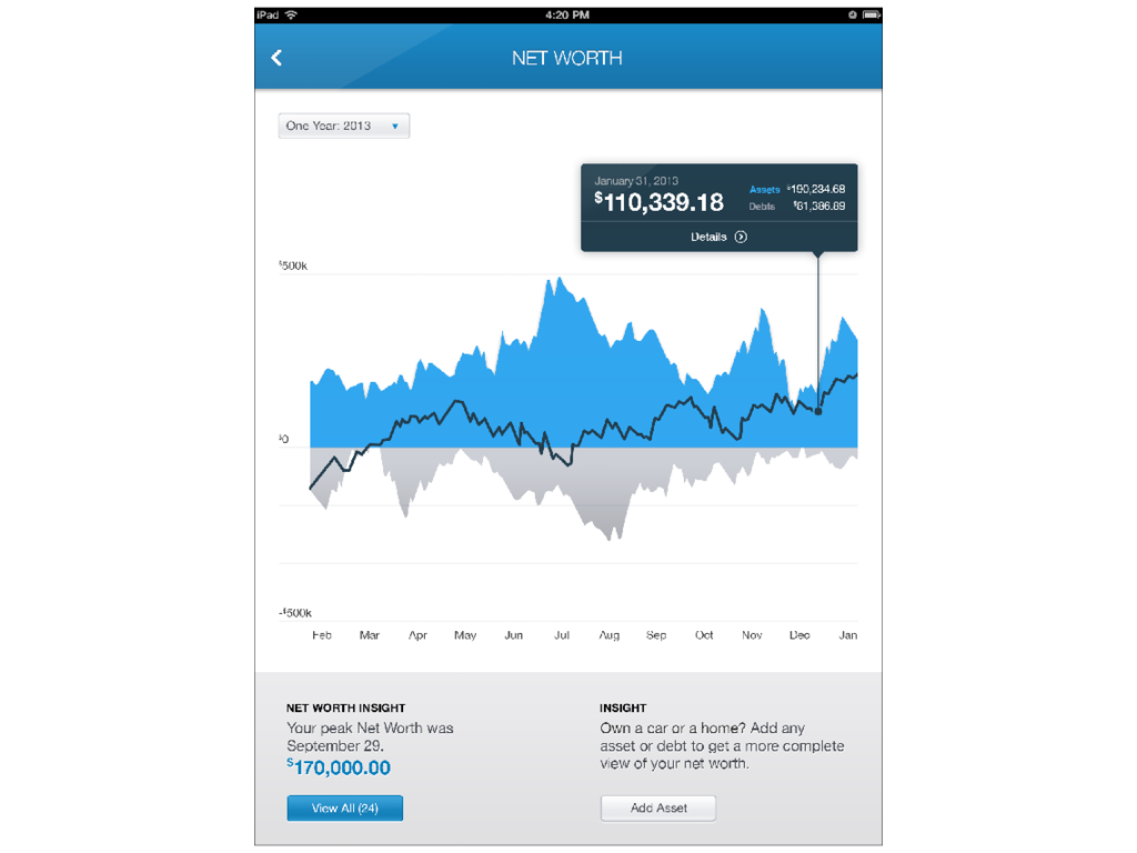
Chase’s first generation tablet app used the same navigation, UX and technical architecture as the first generation mobile app released in 2010. The new version of the table app departed form the existing app by introducing a personalized user experience with geo-location images, a new navigational structure, extensive use of data driven infographics and a suite of intuitive personal financial management (PFM) tools.
My Role
As the design director, I was responsible for the day-to-day management of the internal and 3rd party design resources. I led the creation of the UX interaction model, art directed the visual design by ensuring the experience was aligned to Chase’s brand standards, provided feedback on the content creation and used my extensive financial product knowledge to help define the various product features used through out the experience.
In addition to my design responsibilities, I helped coordinate the various quantitative and qualitative user research studies, assisted the program manager with scheduling and budget planning and partnered with business owners to define the product requirements.
Results
This new tablet enabled the various Chase business units to deepen relationships with the customers and clients, increase revenue through account openings and expand their omni-channel digital strategy.
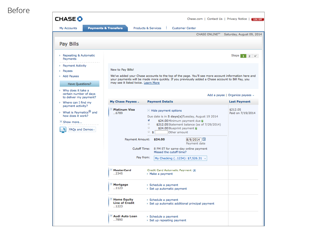
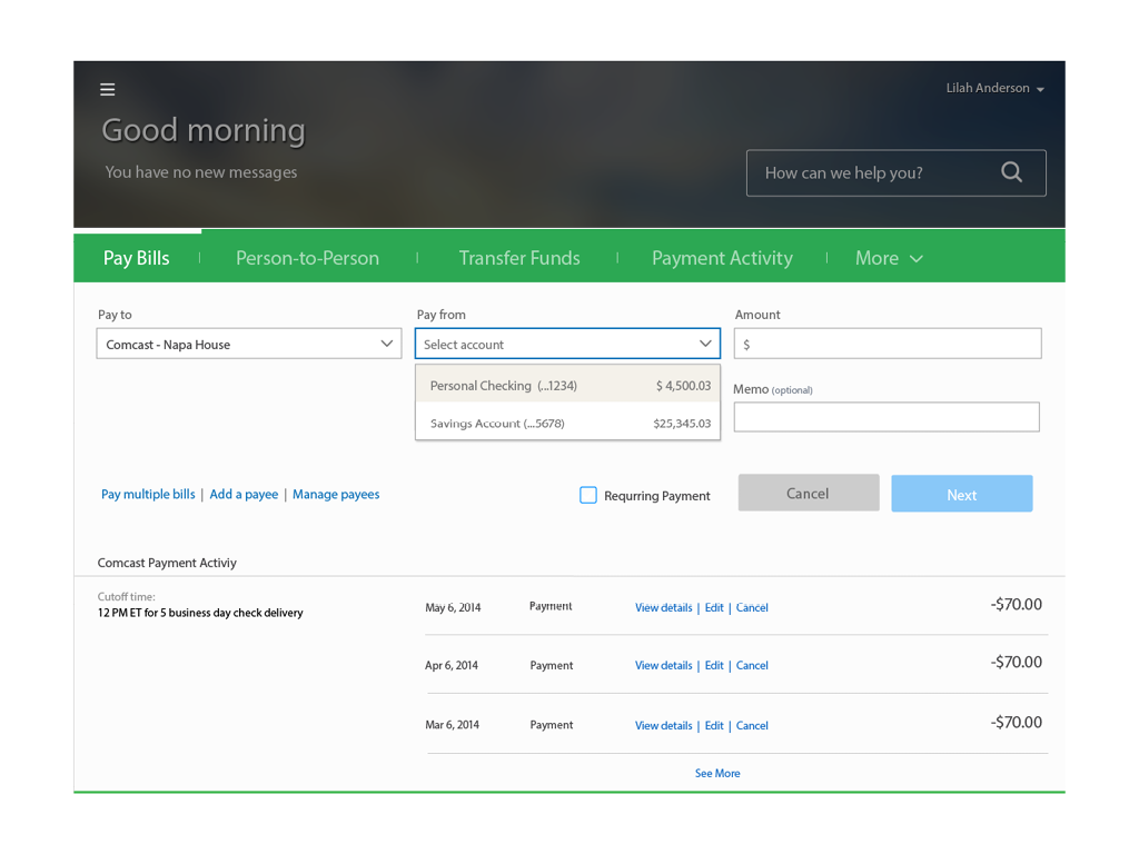
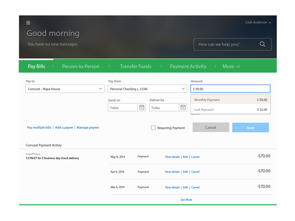
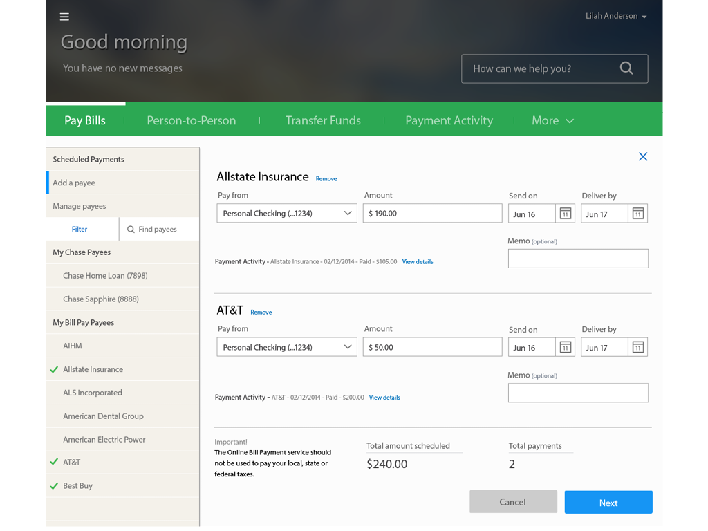
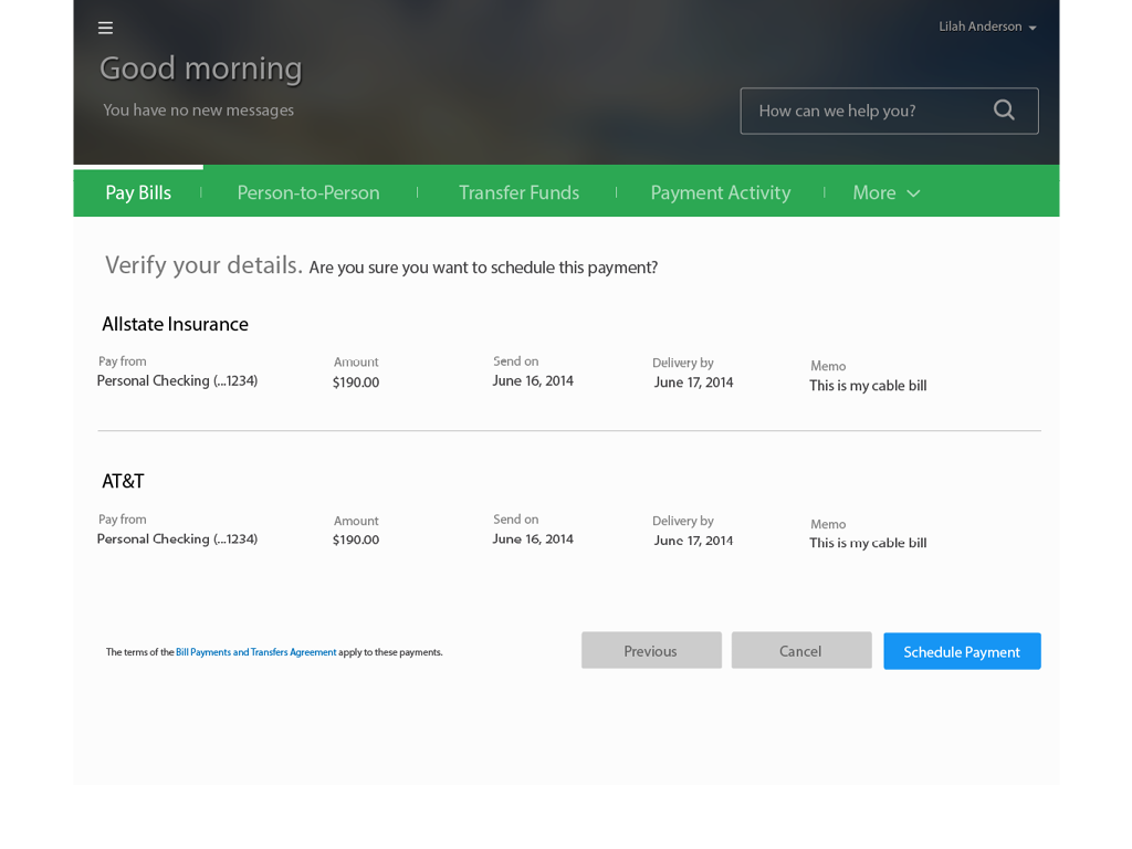
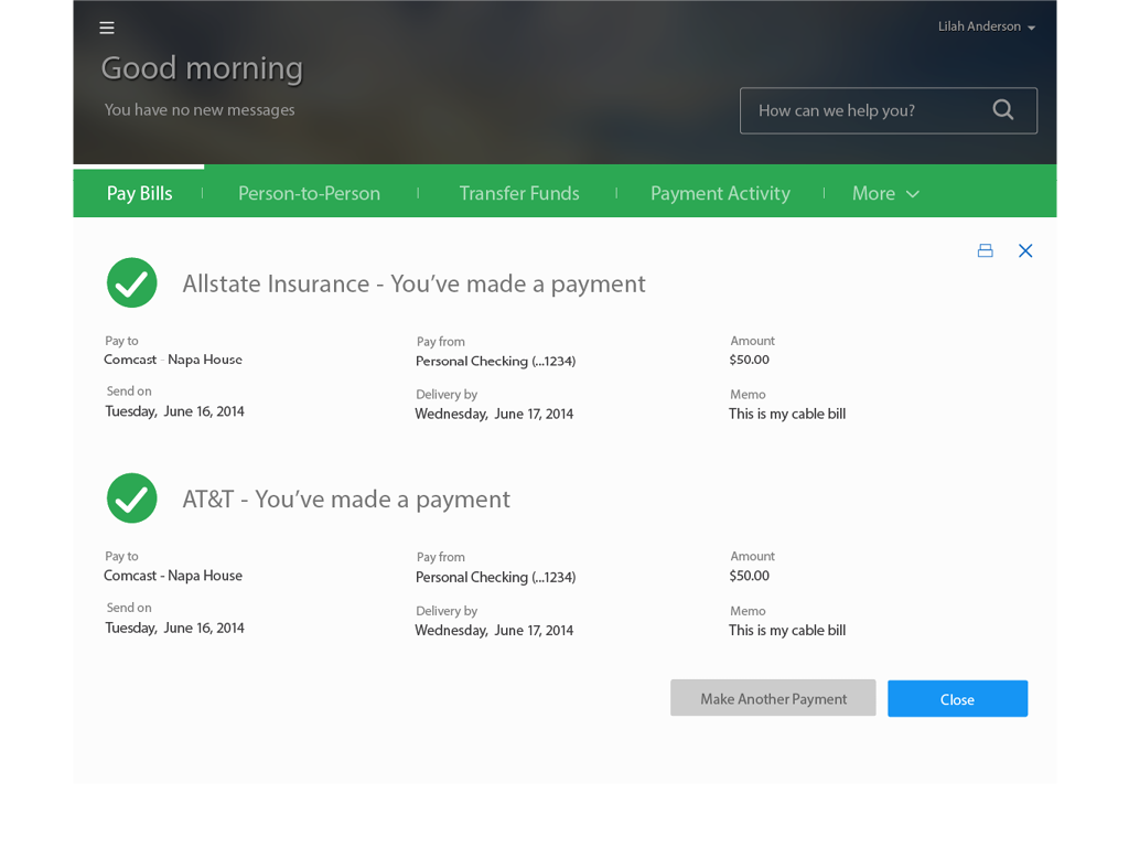
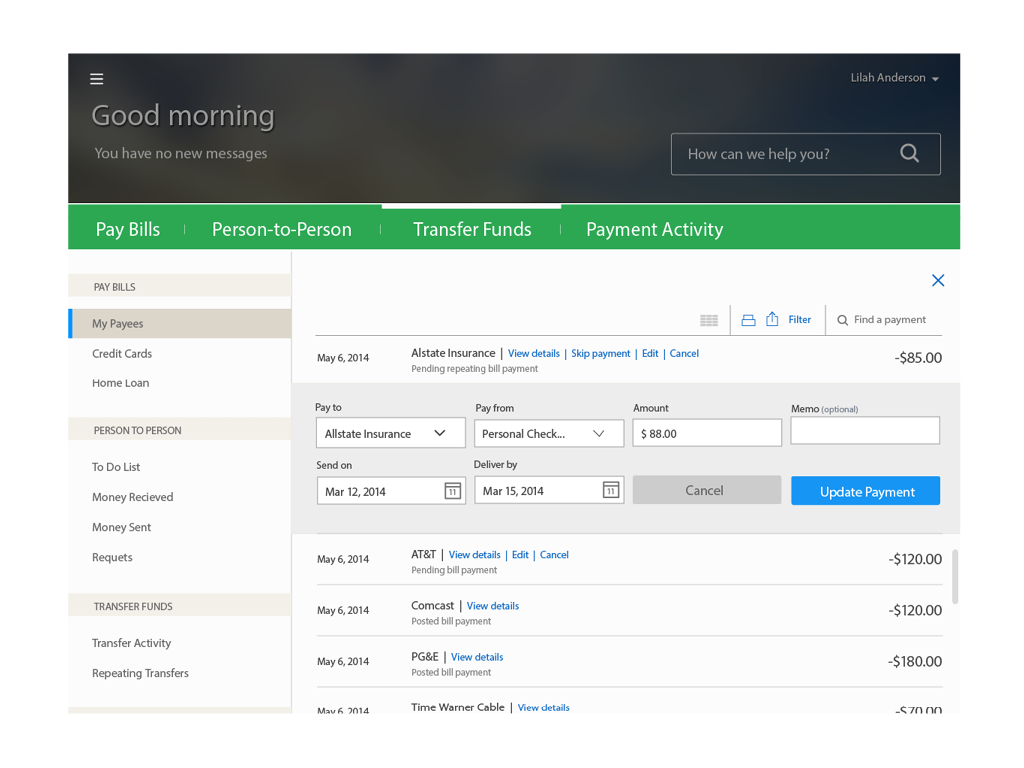
On-line Payments
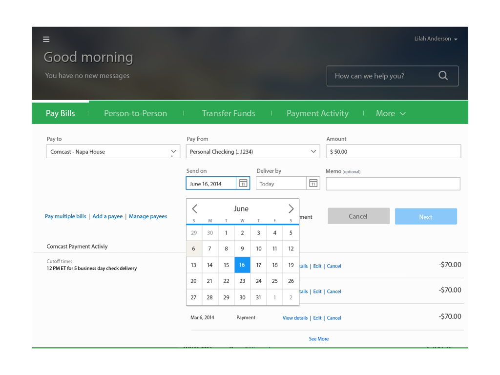
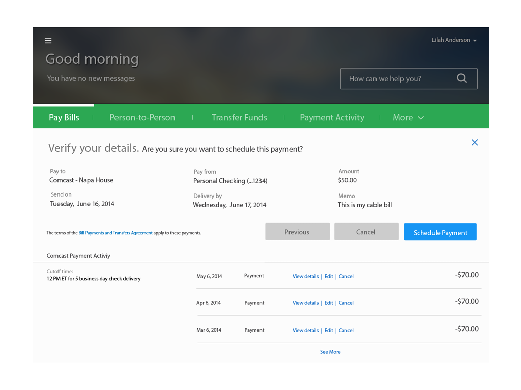
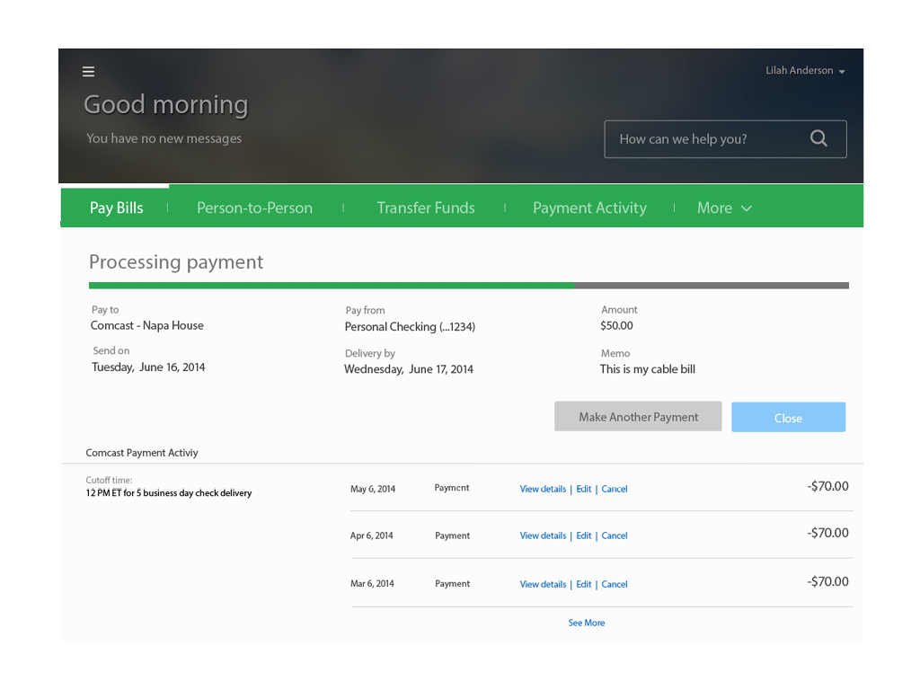
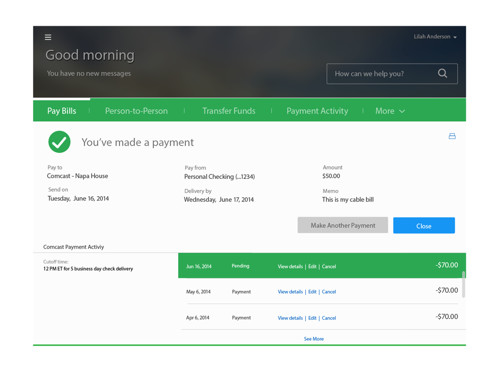
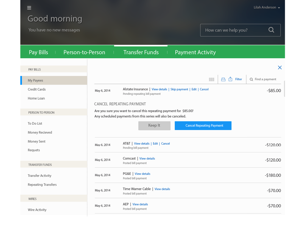
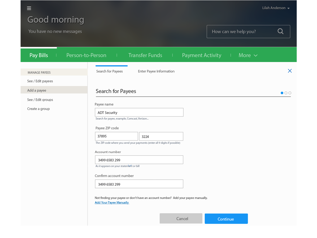
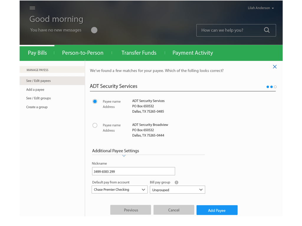
Simplified, cross-product payment experience.
Opportunity
On average, Chase processes 50 million payment transactions per month through chase.com. In order to support this volume of activity, the payment experience needs to be robust, easy to use and support all of Chase’s payment products. Voice of the Customer surveys and user testing revealed that customers found previous versions of the payments experience overwhelming, required too many clicks to complete a task and weren’t optimized for smaller tablets or mobile devices. The goals of the redesign were to simplify the number of steps required to complete a task, reduce the cognitive load of the experience, support and increase transaction volumes of all payment products and be available on all device types by leveraging a responsive web framework.
My Role
I managed a team of 12 UX and visual designers responsive for producing design deliverables. I partnered with the various product owners to define/refine the business requirements to ensure we optimize the experience and remove all legacy requirements. My team and I supported the in-sprint user testing by providing prototypes and other testing materials to the user research team. I worked closely with the various development teams to provide feedback during deck checks and end of sprint reviews. As the product design lead, I was also responsible for providing updates to senior stakeholders and participating in “road shows” within the organization.
Results
The redesign experience resulted in a 30% increase of transaction volume across all products. Reduced the task completion time to an average of 25 seconds to complete a one-time payment. Increased customer satisfaction scores from 55 to 83. Standardized the payment experience across all 14 payment products. My team and I received a U.S. Patent for the innovative user experience.
Credit Card Application
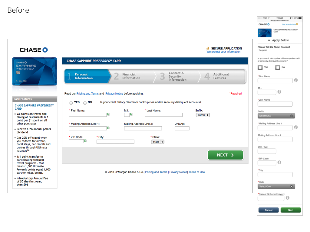
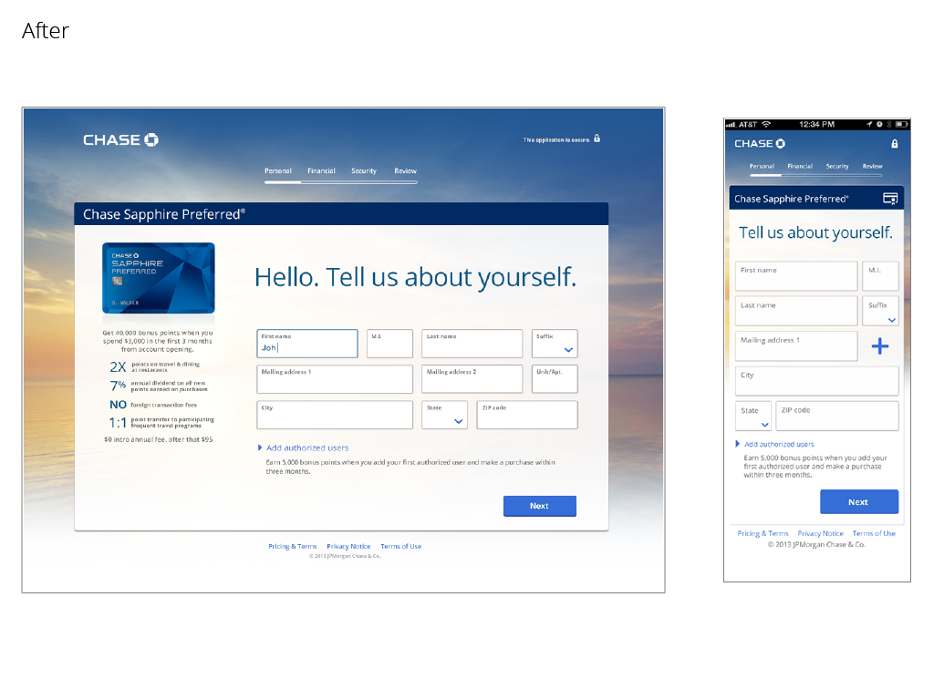
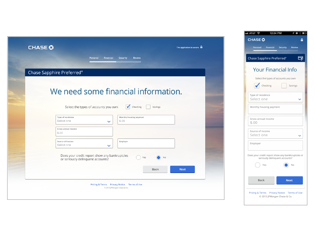
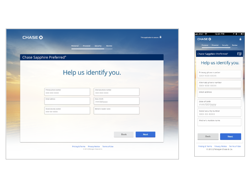
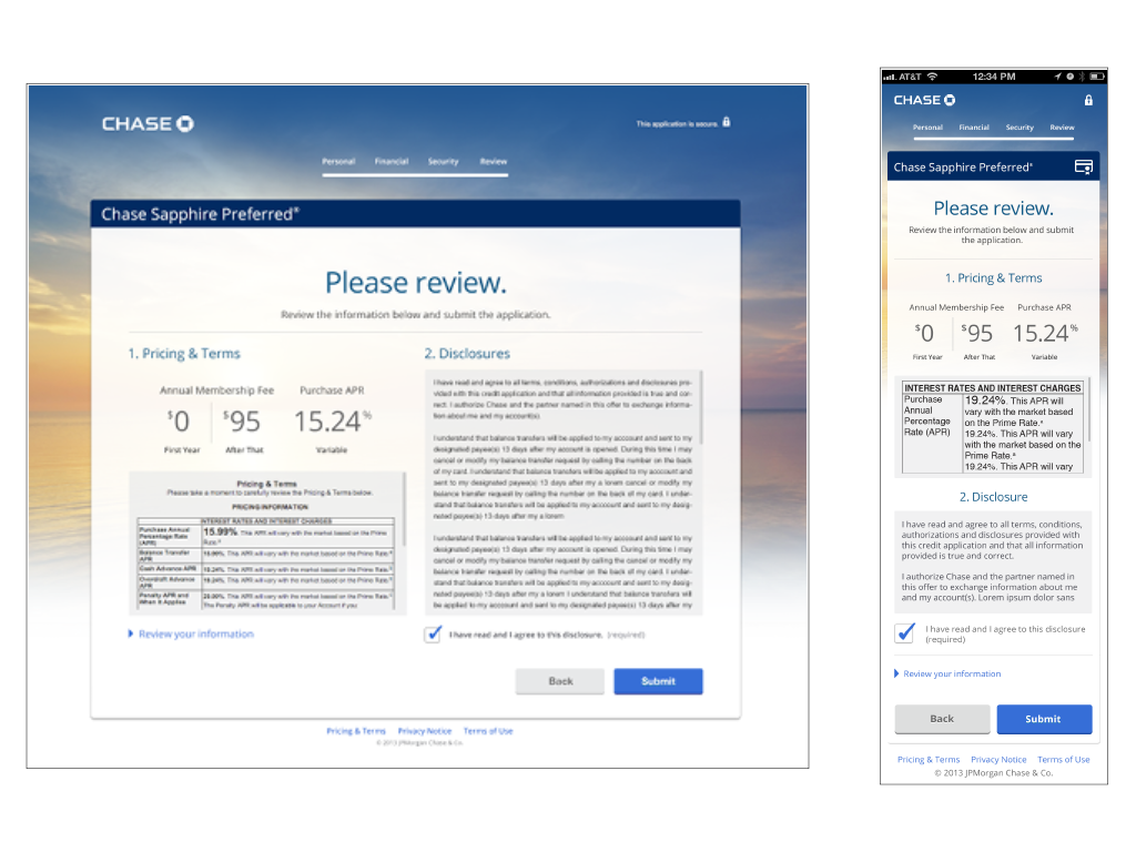
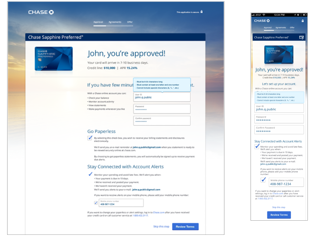
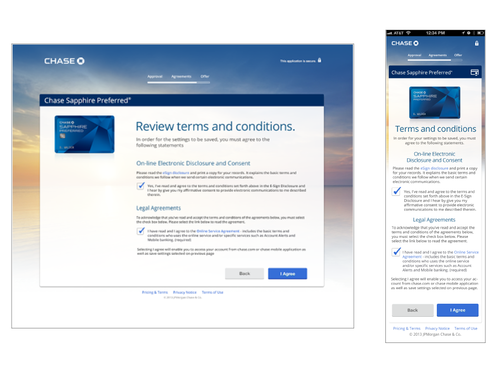
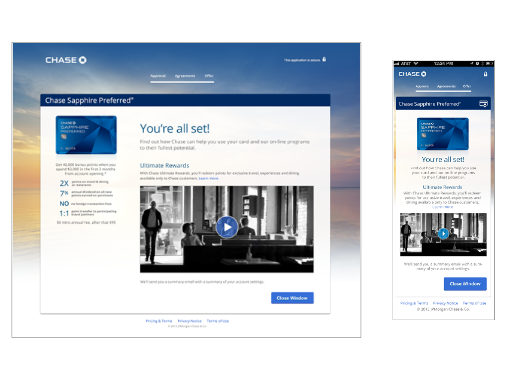
Chase’s first responsive web experience.
Opportunity
Create a solution that reinforces the individual brand attributes and clearly communicates the benefit to each of Chase’s 29 consumer and business credit cards to customers. Build a responsive web application to reduce development costs and decrease time to market. Provide the user with a simple, welcoming and visually engaging experience. Use language and tone similar to how a bank branch employee would speak to customer in person.
My Role
I managed a small team of UX and visual designers responsive for producing design deliverables, partnered with the product team to define the business requirements, presented the experience to senior stakeholders, as well as collaborated and provided feedback to the development team.
Results
Within the first 30 days of its launch, Chase saw a 4% increase of approved applications, 160,000 new credit card customers and added $72 million of new revenue. The new platform enabled the rollout of new applications for all 29 credit cards in less than a year.
Web Portal
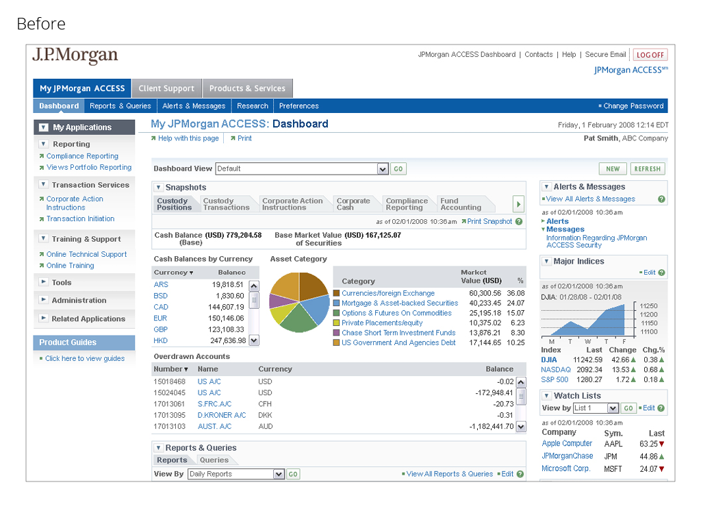
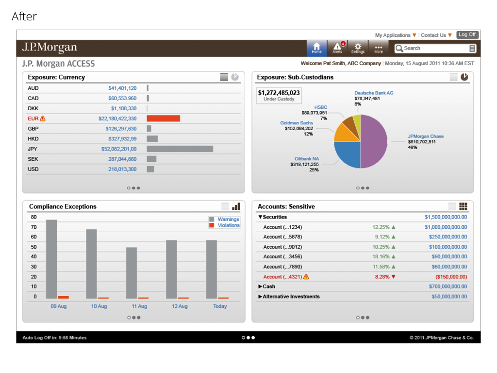
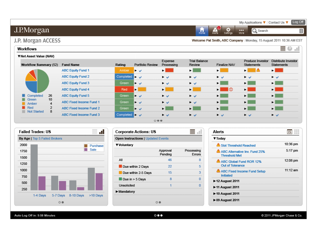
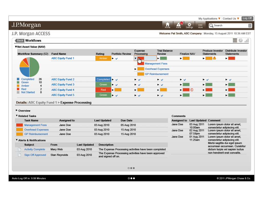
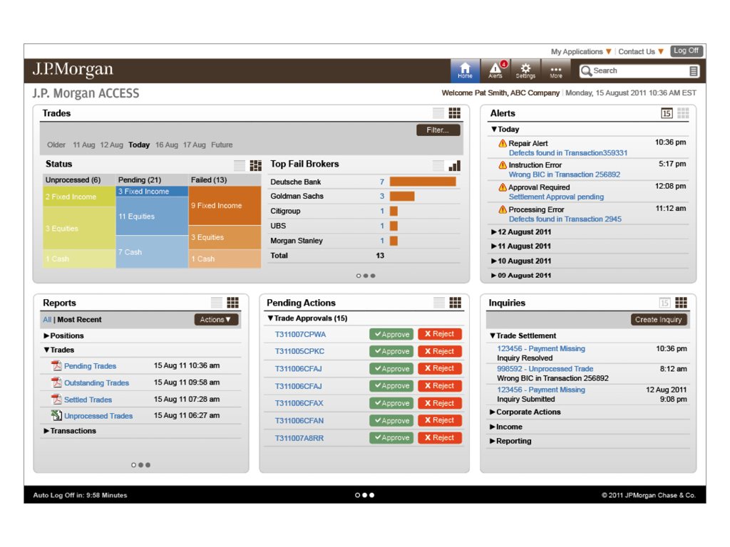
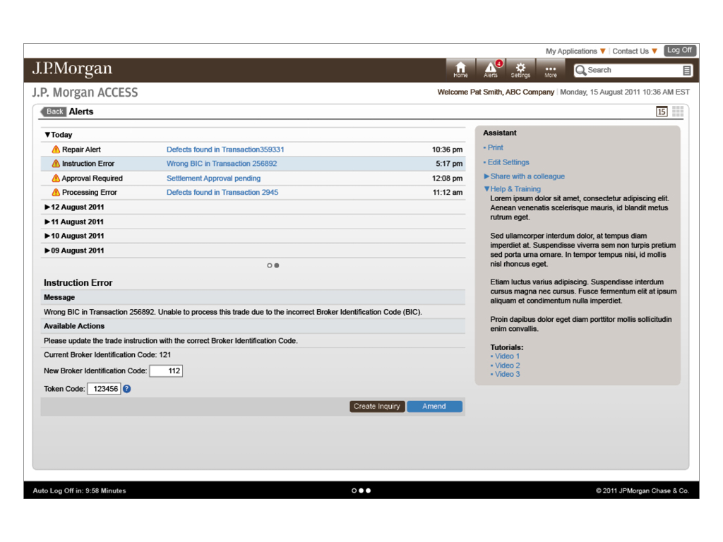
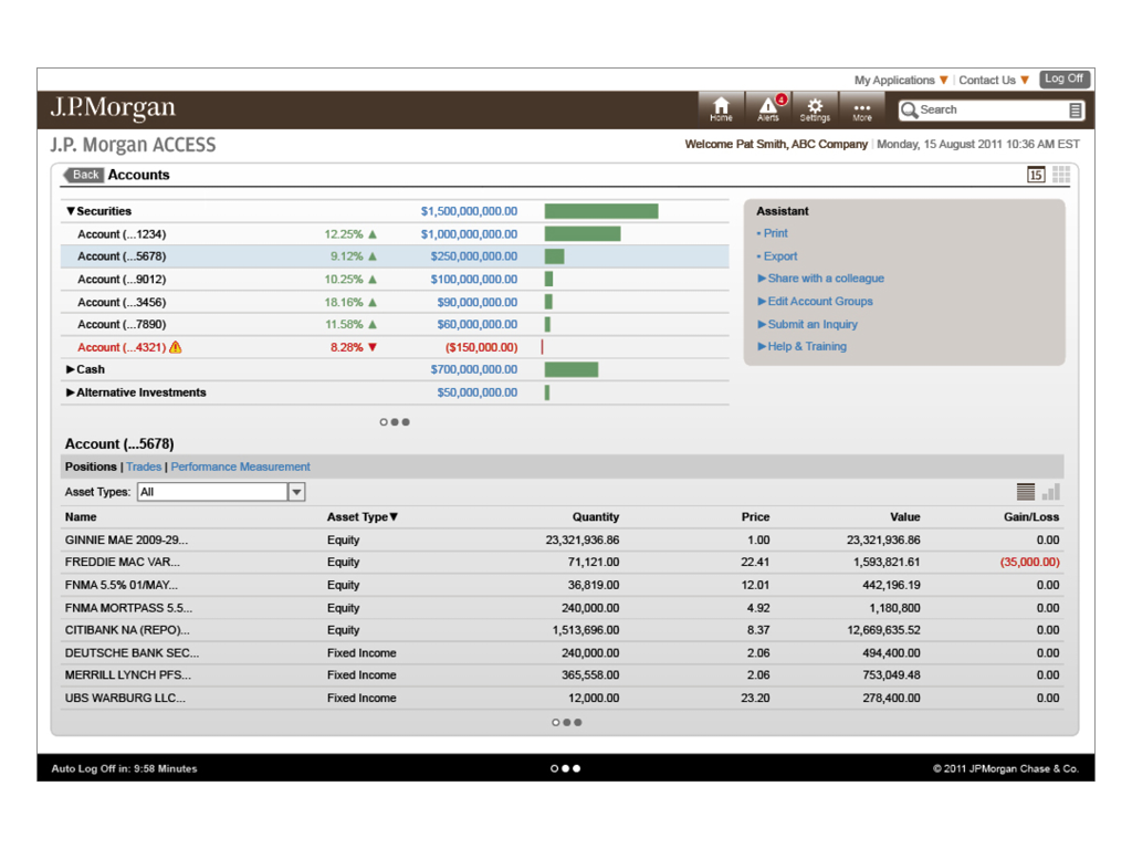
Role base, enterprise solution for J.P. Morgan’s institutional clients.
Opportunity
Because the “Jobs to Be Done” vary widely for institutional clients, J.P. Morgan’s Investor Services felt it was strategically important to provide a highly personalized, role based experience to their users. This new platform would utilize data cube analytics and personalization engines to enable executives, operations managers and staff to manage their business critical exceptions from a single web portal.
My Role
I led a small team of UX designers, user researchers, and front end developers to build out a proof of concept. I lead and conducted 30 on-site in-depth interviews (IDIs) across the globe to gather detailed user requirements for the all the different roles within our clients’ organizations. We used our finding to define the business and technical requirements for the new platform. I partnered with the development lead and data architect to understand the capabilities of our technical solution.
Results
The solution removed the need to use separate applications by providing all the information in a central location resulting in increased productivity and reduced the time required to make business critical decisions. The user experience required less clicks to retrieve information and the optimized the data display reduced the cognitive load for the user. The use of UX components reduced the development time and enabled a fully personalized as well as customizable user experience.
Performance Tablet App
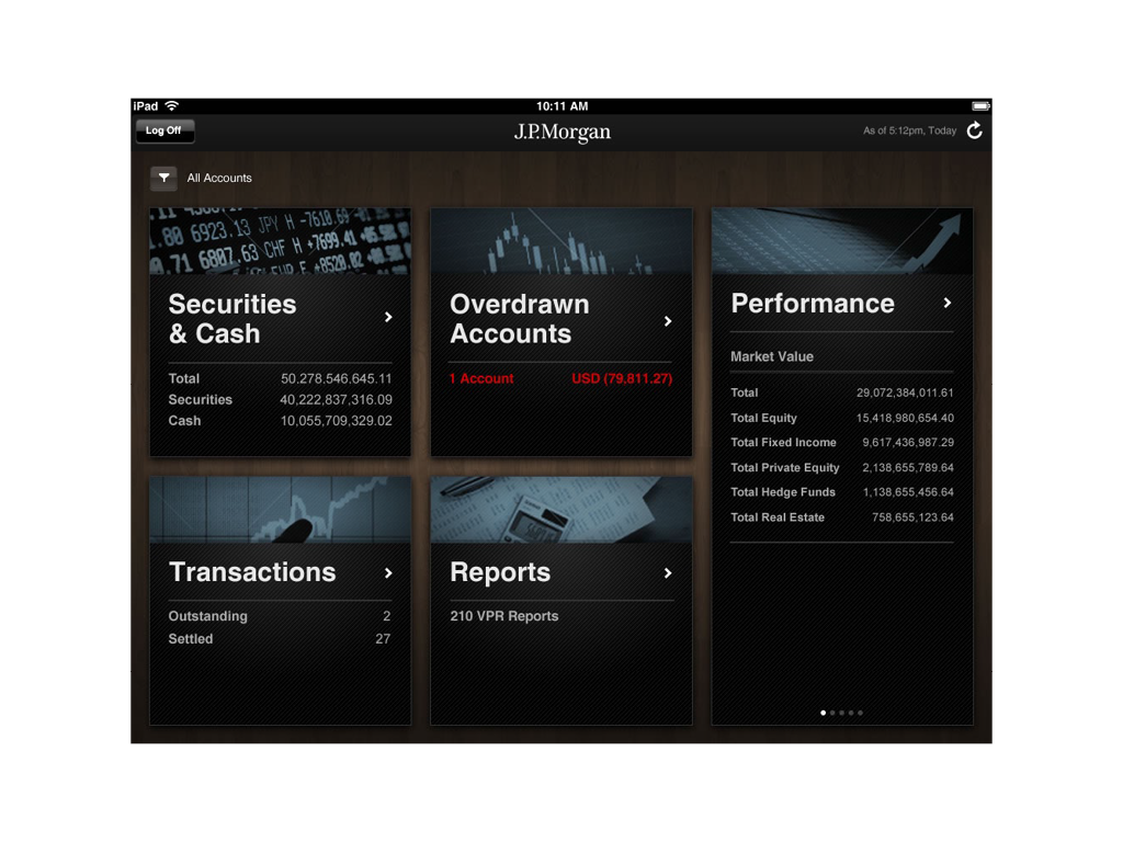
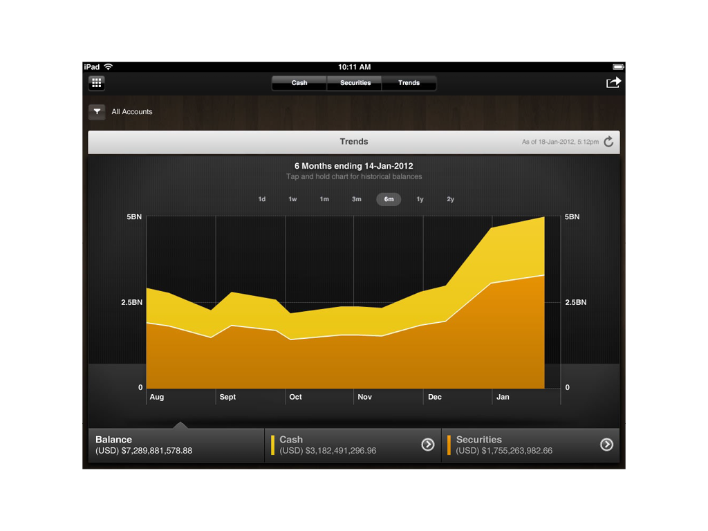
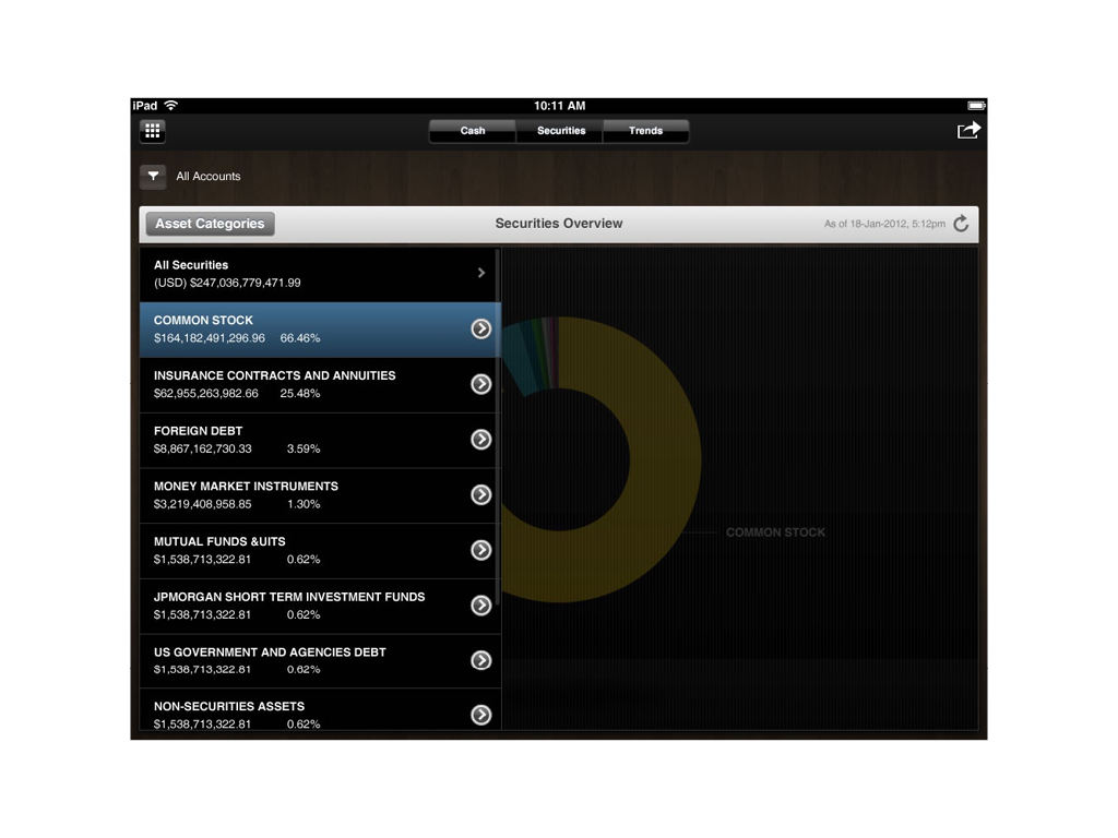
This app was developed as a sales tool to be used by client relationship managers.
User Needs
Institutional clients would be able to view performance data of their various portfolios, access custody reports and get real-time cash balances.
Business Needs
This project also demonstrated the ability to build a tablet application that would leverage the same architectural framework that served data to the online products.
My Role
I was responsible for providing interaction and art direction as well as acting as a subject matter expert to the design team.
